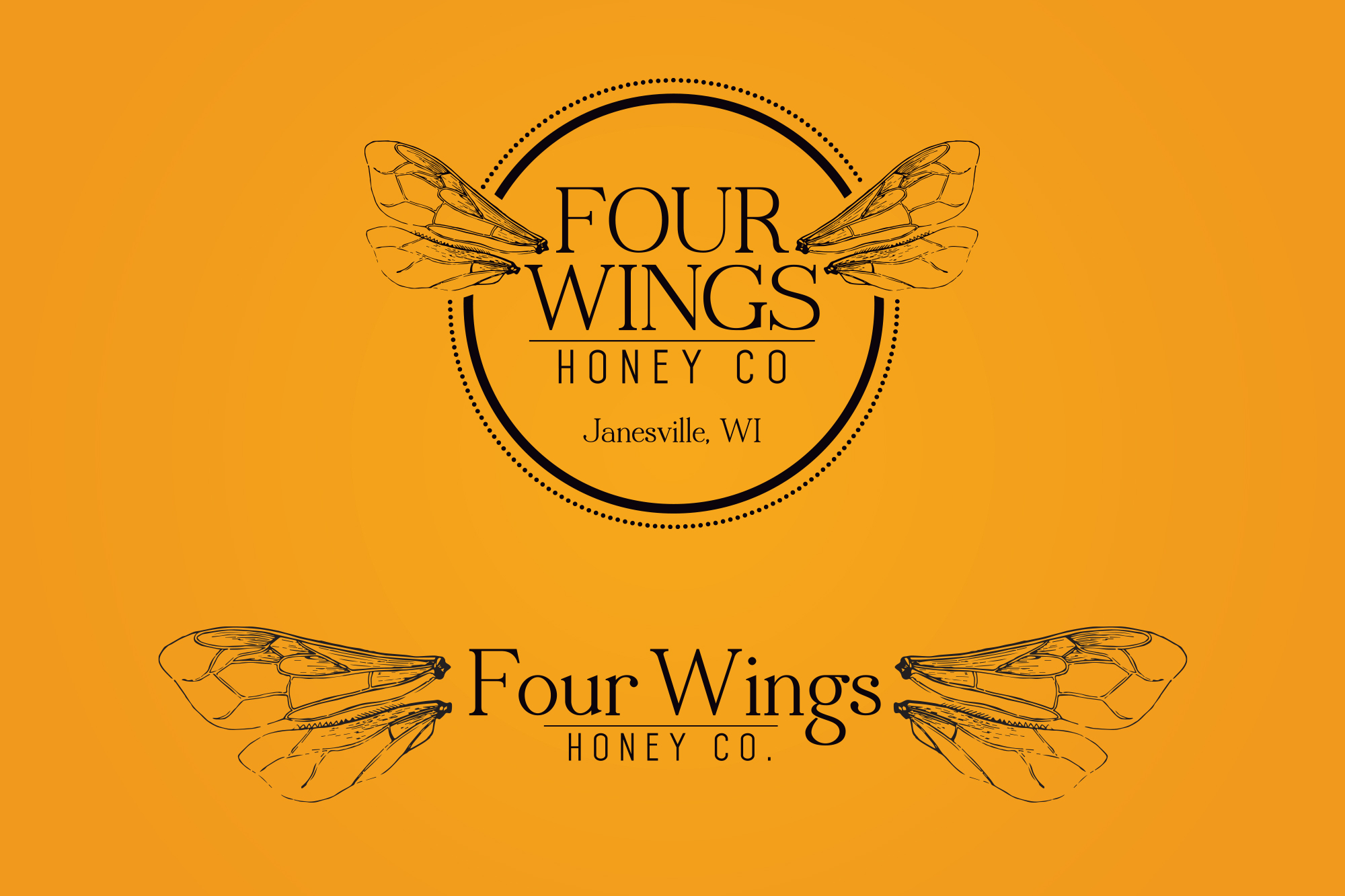
The logo for Four Wings Honey Co. is a harmonious blend of simplicity and symbolism, encapsulating the essence of the honey-making process and the brand's commitment to quality. The design features four delicate honeybee wings arranged symmetrically to form a cohesive and elegant emblem. The wings symbolize the tireless work of bees, emphasizing the natural and artisanal aspects of the honey production. The warm, golden hues of the brand not only evoke the rich color of honey but also convey a sense of warmth and authenticity. The typography is crafted with a clean and modern font, ensuring clarity and readability. This thoughtfully designed logo not only captures the spirit of Four Wings Honey Co but also establishes a visually appealing and memorable brand identity that resonates with honey enthusiasts and connoisseurs alike.
Client
Four Wings Honey Co
Services
Logo Design
Branding Package
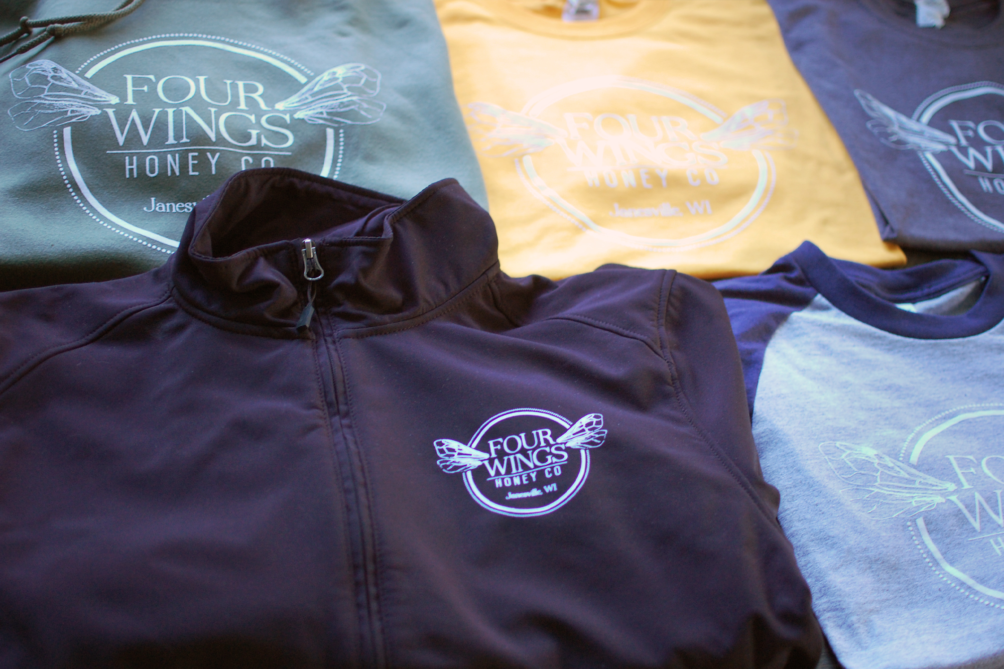
Marketing Collateral
Apparel
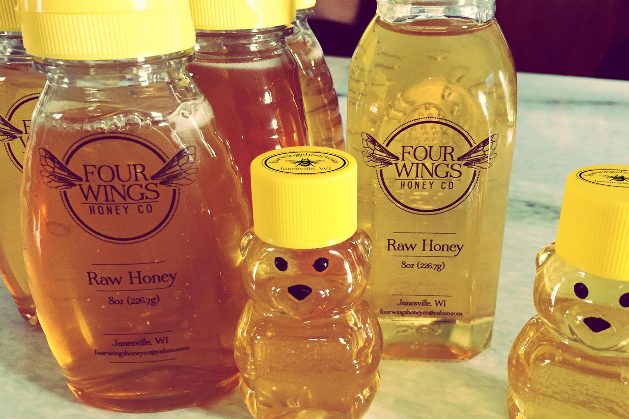
Labels
Art Direction, Logo Re-Design, Marketing Materials
The logo for Four Wings Honey Co is a meticulously crafted representation that weaves together symbolism and aesthetics to encapsulate the essence of the brand. Central to the design are four intricately detailed honeybee wings arranged symmetrically, forming a cohesive and visually striking emblem. These wings symbolize the industrious nature of bees, highlighting the diligence and precision involved in honey production. The careful symmetry not only reflects the order found in nature but also imparts a sense of balance and reliability, reinforcing the quality and consistency of Four Wings Honey Co’s products.
A warm and inviting color palette dominates the logo, with golden hues reminiscent of the rich, amber tones of honey. This deliberate choice not only pays homage to the primary product but also evokes feelings of warmth, natural goodness, and authenticity. The golden wings stand out against a subtle backdrop, creating a visually pleasing contrast and drawing attention to the intricate details of the design. This thoughtful color scheme resonates with the company’s dedication to delivering premium honey products that are as visually appealing as they are delicious.
The typography in the logo is carefully selected to complement the overall design. A clean and modern font is chosen, ensuring legibility and clarity. The simplicity of the typography allows the focus to remain on the symbol of the wings while providing a contemporary and timeless aesthetic. This balance between intricate symbolism and clean typography contributes to a logo that is not only visually appealing but also communicates Four Wings Honey Co’s commitment to quality and craftsmanship.
In conclusion, the logo for Four Wings Honey Co is a testament to the brand’s dedication to capturing the essence of its products. Through the skillful integration of symbolism, color, and typography, the design succeeds in creating a distinctive visual identity that conveys the meticulous care and authenticity embedded in every jar of honey produced by Four Wings Honey Co.
Pantone® 130 C
C0 M30 Y100 K5
#F2A900
Pantone® 2013 C
C0 M48 Y100 K0
#FF9900
Pantone® White
C0 M0 Y0 K0
#FFFFFF
Pantone® Black C
C0 M0 Y0 K100
#27251F